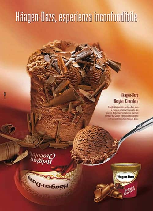
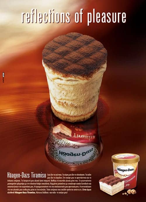
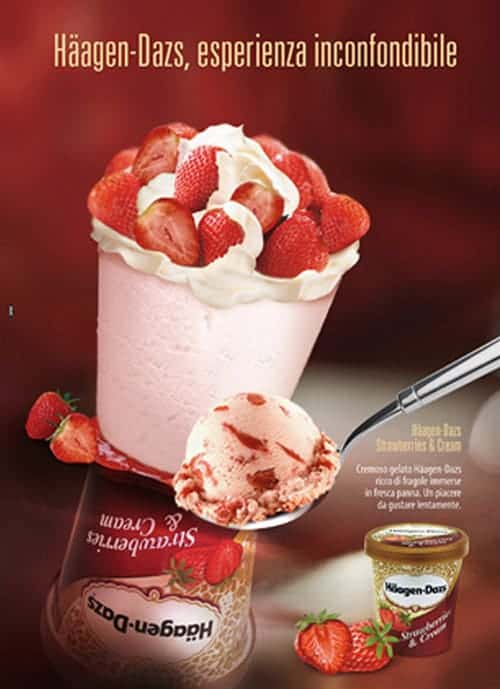
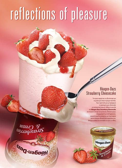
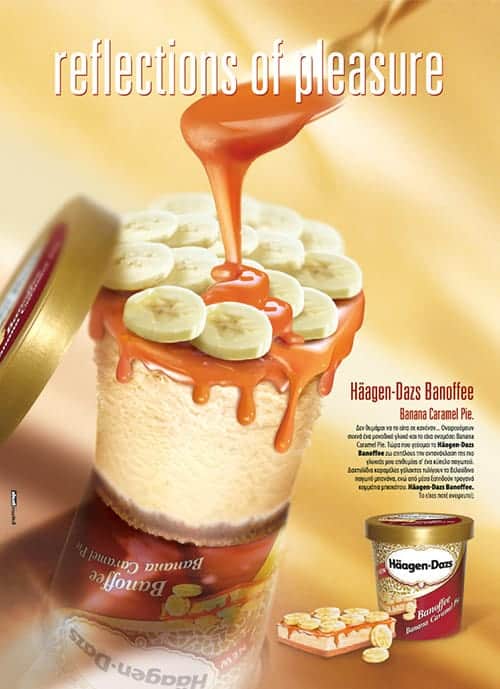
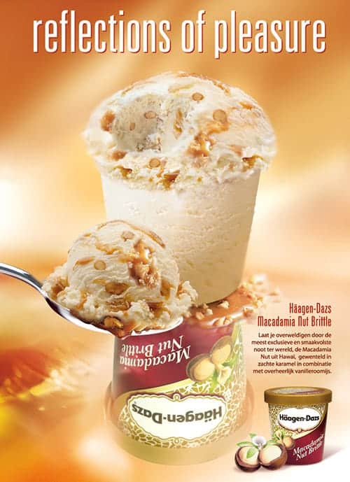
On the whole, the visuals focus on the ‘bare’ product and convey a message:
• In terms of promise.
Centred on the palatal pleasure -benefit acknowledged by the whole sample as a typical and key element of Häagen-Dazs.
• In terms of reason why.
Supported by the full and rich organoleptics of the product – e.g. visual of flakes/pieces of fruit + ice-cream which suggests a ‘complex’ texture, thus offering a superior consumption experience.
The two other ‘key’ elements of the visual are:
• The background.
Bright and warm colours, shades – it recalls a mood of intimate, warm, ‘dedicated’ consumption. In the interaction with the representation of the ice-cream, it stresses the intensity of the palatal pleasure.
• The reflected pint.
Is a ‘sign’ of the brand which – although not in the foreground at a perceptive level – makes the message richer in the interaction with the representation of the ice-cream.
• It gives value to the products:
It identifies them and therefore ‘reflects’ on them the heritage of the brand – an effective message, particularly for those who are already aware of Häagen-Dazs.
• It is given value-to by the products.
Häagen-Dazs is a brand which can propose extremely appealing products – an effective message particularly for those who are not aware of Häagen-Dazs.